We built products to support every user role in the Contact Center ecosystem, including administrators, supervisors, agents, and end consumers. Voice and Chat were the core channels of the business, equipped with AI-powered tools to enhance agent effectiveness in supporting end users. However, these platforms had been originally designed over seven years prior, prompting the need for modernization.
This recognition sparked an initiative to refresh the entire product suite. The effort aimed to elevate the user experience and establish a unified design system that would influence future product development across the organization. Leading this initiative was the launch of a new platform: a Mobile App designed to empower agents with on-the-go access to essential tools and customer interactions.
I collaborated with the UI Director on the Mobile and Voice/Call apps. However, I led the majority of Mobile's design work and the Chat Messaging app. I also collaborated with Product Managers on understanding and refining the user experience.
A key milestone in this effort was the introduction of a brand-new mobile app—created specifically for customer service agents who are remote, in the field, or frequently on the move. Before the app, agents were restricted to desktop computers during business hours at fixed locations. With an increasing shift from desktops to laptops, and a growing demand for flexibility and portability, the mobile app addressed a critical gap in the agent experience.
The app integrated core functionality from previously siloed platforms, specifically Call/Voice and Chat Messaging, into a unified mobile experience. This convergence was unprecedented, as these channels had historically existed on separate systems. Merging them posed unique UX and technical challenges.
One of my biggest design challenges was adapting complex workflows traditionally performed on desktops to a mobile interface without compromising usability. We prioritized accessibility from the beginning, adhering to WCAG standards tailored for mobile environments where input methods are limited to tapping and gestures.
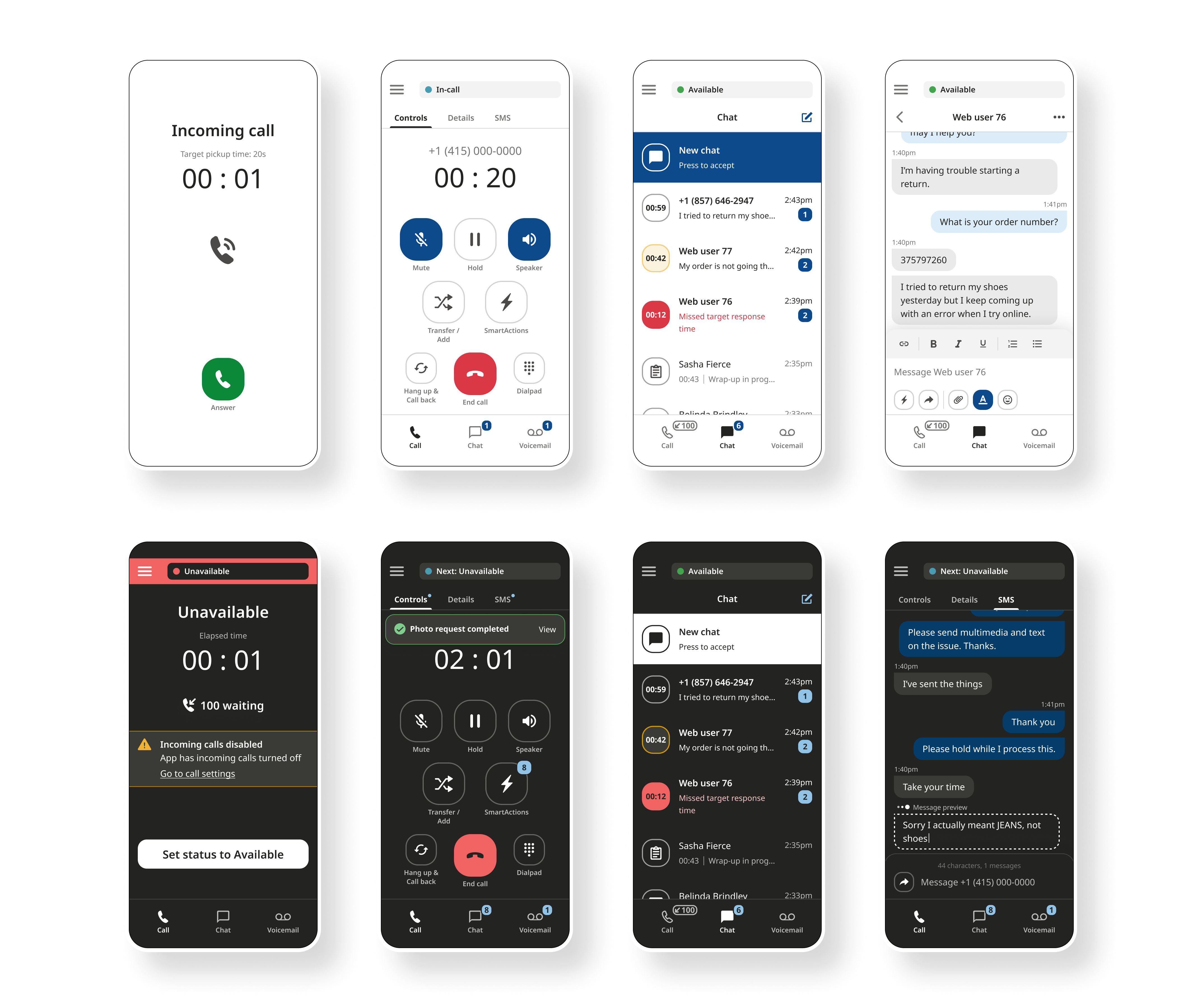
Working in a fast-paced environment, we often had limited time to follow the full UX process. With just 1-2 weeks to deliver several features, we prioritized speed by moving directly to high-fidelity mockups. Since many of these features already existed on other platforms, my focus was on refining and adapting the experiences specifically for mobile.
To improve clarity and cross-functional collaboration, I expanded existing user flows to include detailed descriptions of user actions. This approach helped streamline communication across product, design, and engineering teams, ultimately increasing efficiency during development.
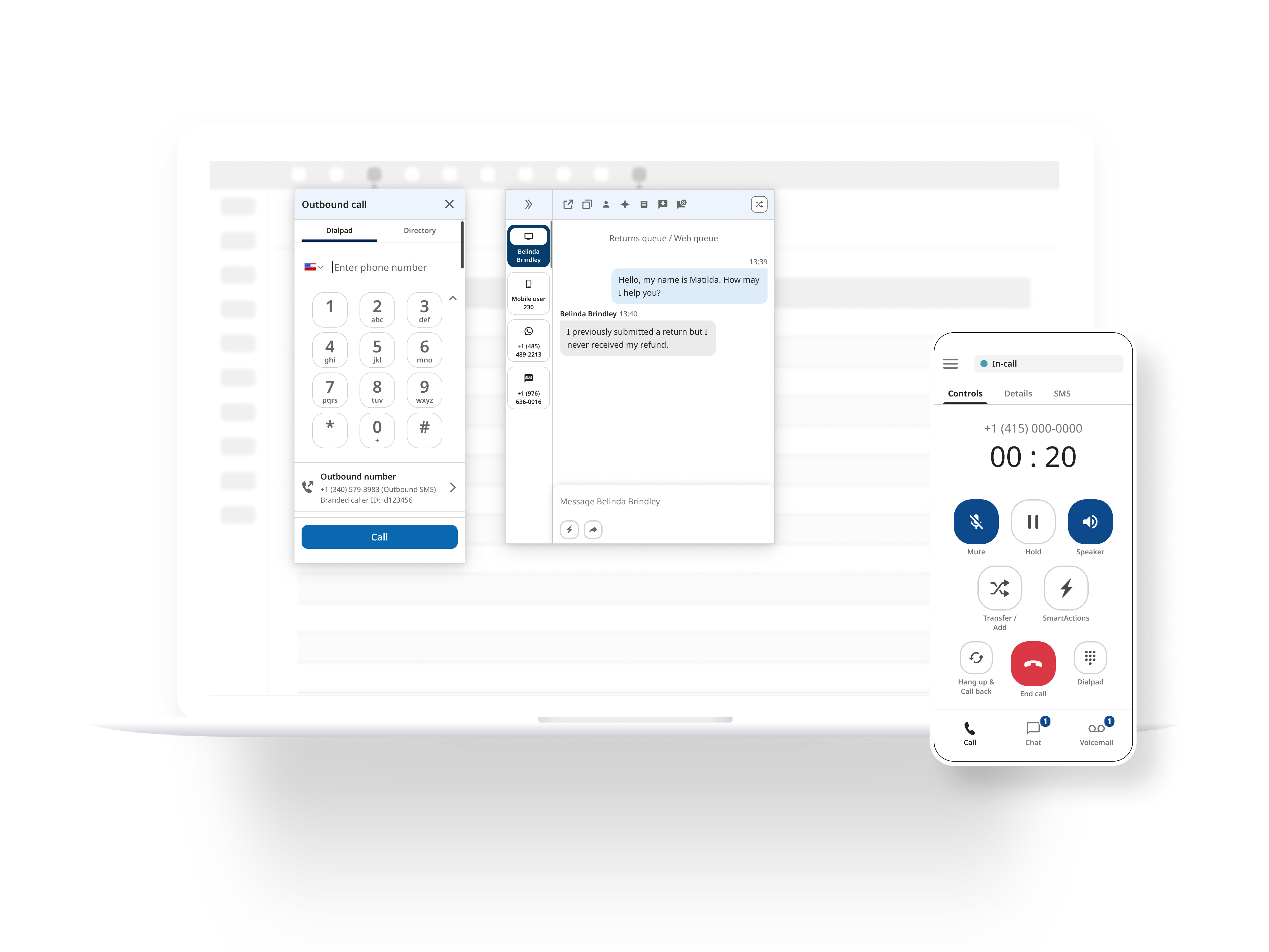
An essential feature of our product was enabling media sharing such as photos, screenshots, videos, and text input during a voice call. Traditional customer support calls are typically limited in terms of what can be shared, especially compared to chat interactions. We aimed to bridge that gap by enhancing the voice call experience, allowing agents and end consumers to communicate more effectively and resolve issues with fewer barriers.

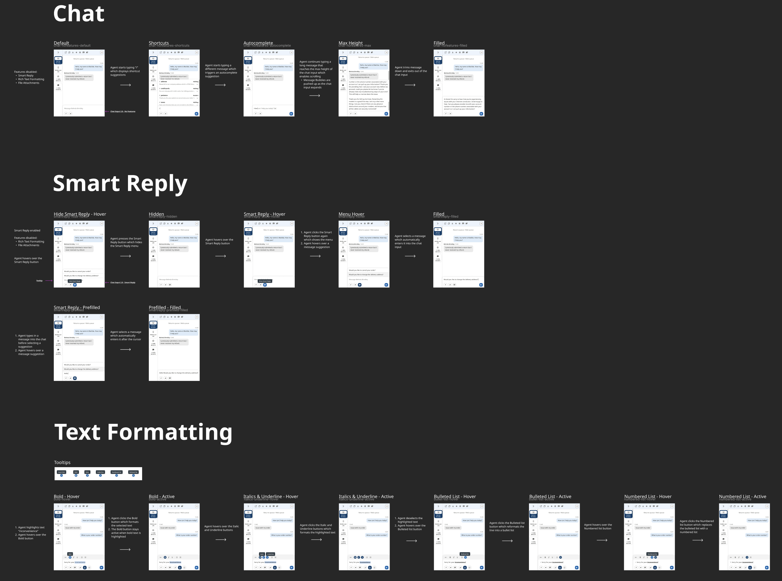
The company’s legacy chat platform had been originally designed over seven years ago and hadn’t undergone a full redesign since its inception. Over time, new features were layered on top of the original framework without cohesive planning, resulting in a cluttered, inefficient interface. As the platform continued to grow, it became clear that a full rethinking was necessary, not just a visual update but a structural one focused on unifying features and improving scalability for future enhancements.
One of our core goals was to enhance the overall user experience for customer service agents. The existing interface was dense and overloaded with information, making it difficult to quickly find the right tools. In a fast-paced customer service environment, speed and efficiency are critical, so agents needed to access essential tools with as few clicks as possible.
The primary design challenge was striking a balance between making all essential tools immediately accessible and maintaining a clean, intuitive interface. I collaborated closely with the product manager to analyze usage data and gather input from agents. Together, we identified the most frequently used features and prioritized their placement in the UI, particularly in the toolbar, to streamline workflows and reduce cognitive load.
This redesign not only simplified the interface but also created a scalable foundation that supports ongoing growth and feature development.
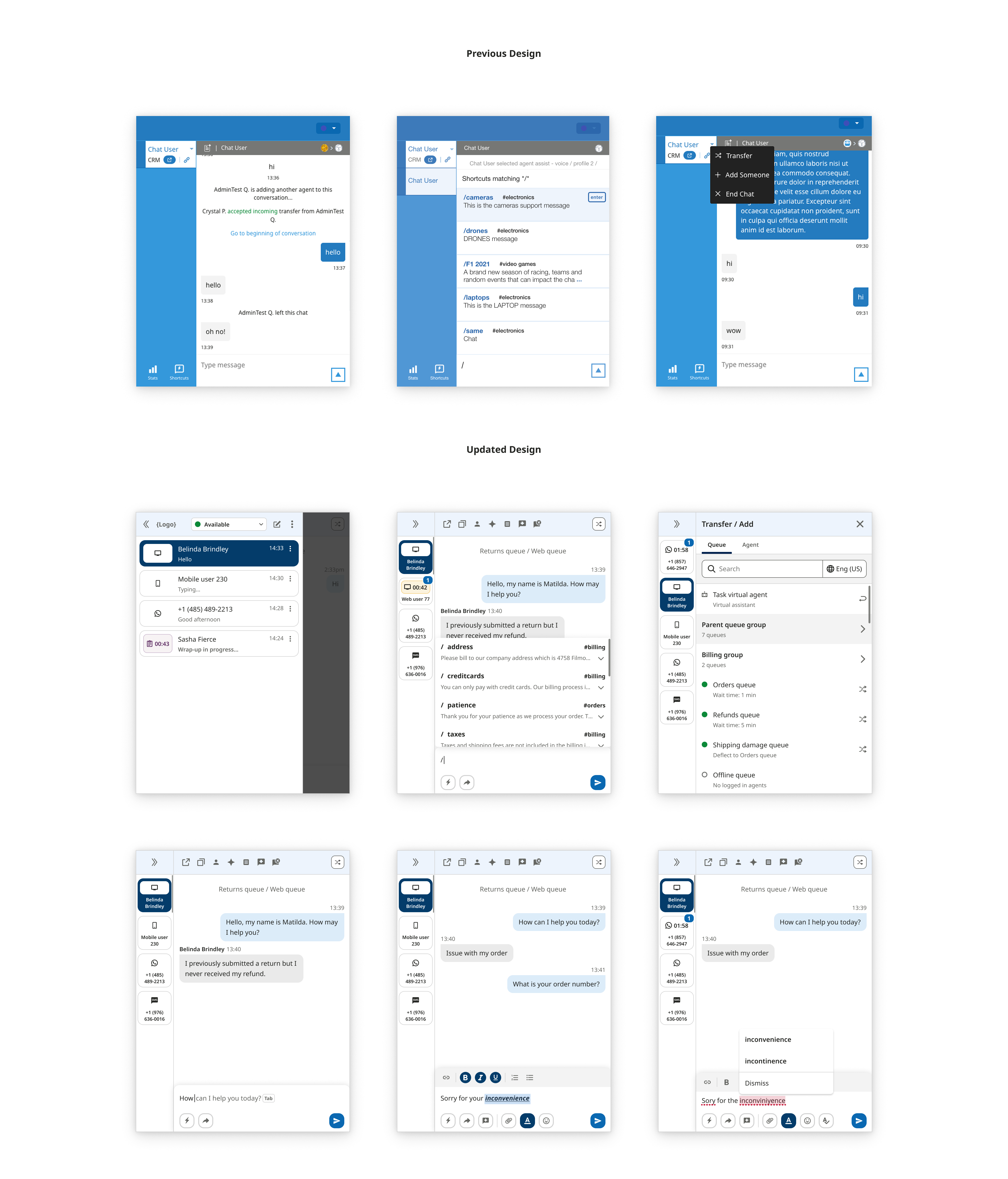
A later project introduced long-awaited, high-impact features to our Messaging platform, specifically text formatting and file attachments, both of which had never been available before. These features were among the most frequently requested by our customers. Agents often struggled to structure their responses clearly or emphasize critical information due to the lack of rich text capabilities. In an industry where clarity and efficiency are essential, this limitation was becoming increasingly noticeable, especially as text formatting had become a standard expectation in modern communication tools.
Adding support for file attachments further empowered agents to provide more effective support by sharing relevant documents, images, or reference materials directly within the conversation. This significantly enhanced the platform's utility and improved the end-user experience.
Recognizing that the existing Chat Input UI was designed only for basic functionality, I took this opportunity to rethink its layout. To support future scalability and prevent interface clutter, I introduced a secondary toolbar. This allowed new features, like formatting tools and attachments, to be added without overwhelming the main text input area. The design anticipates ongoing feature growth while preserving usability and focus.
These enhancements were implemented across both the Web App and the Mobile App, ensuring a consistent and modernized experience across platforms.
Just as the Chat Messaging platform received a full enhancement and revamp, the Call platform received one as well. The Call app is our most complex and feature heavy product. My UI Director led this project and I provided assistance in developing the design system and features consistent with other platforms.
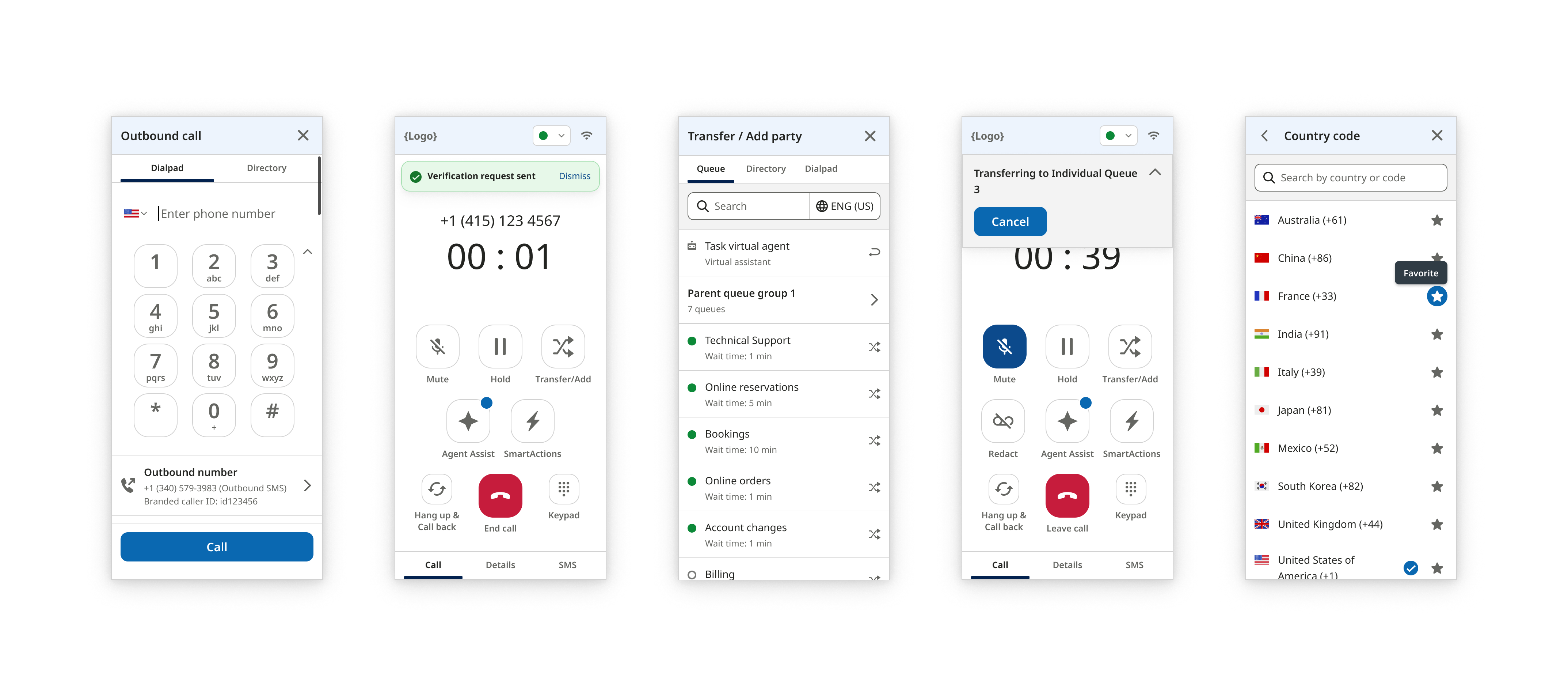
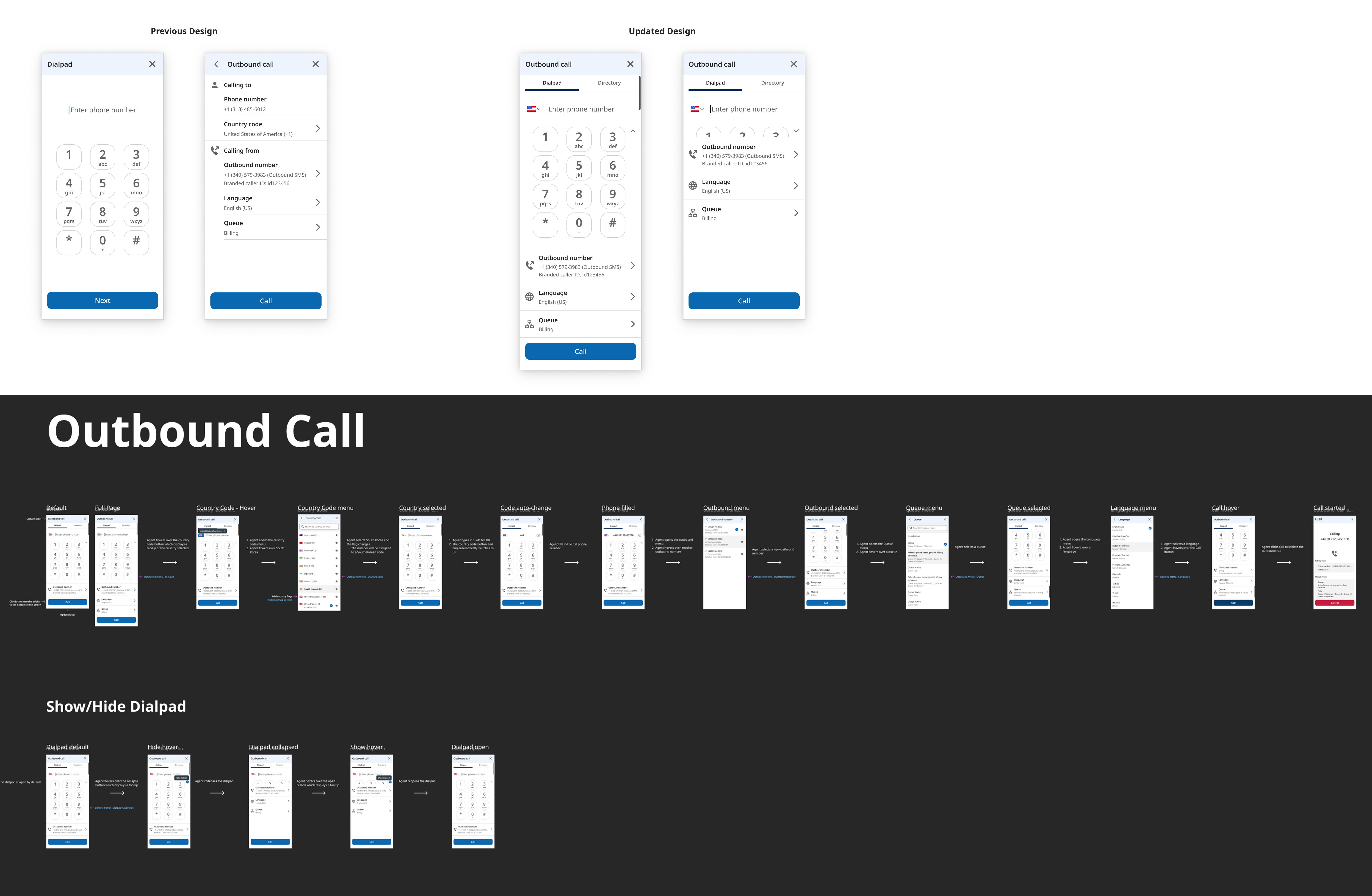
A customer was facing a problem dialing for international phone numbers. They would encounter issues entering a phone number without a country code. Our solution was to add a user-friendly way to select a country code by introducing a country code dropdown. I covered edge cases where agents could manually type the country code instead of selecting. It would automatically recognize a country code and update the country code selector. In addition to adding a country code selector, I consolidated the dialing flow into a single screen based on customer feedback. The flow was originally broken into 2 steps which was unnecessary and reduced efficiency. Including a dialpad is a legacy experience and used by a small number of users. Instead of completely removing it, I added the ability to show/hide the dialpad for agents who prefer typing. Admins should be able to set a default setting for how they prefer for their agents experience.