We built products to support every user role within the Contact Center ecosystem, including administrators, supervisors, agents, and end consumers. Voice/Call, Chat Messaging, and Email were the core communication channels, each originally delivered through its own distinct product experience on separate platforms. These channels were integrated into a standalone mobile app, a desktop application, and a back-end portal for administrators.
With six diverse platforms, each with its own interface, capabilities, and screen sizes, we faced the challenge of unifying the user experience across the entire ecosystem. Our focus was to create a cohesive design system that could scale effectively, improve usability, and drive operational efficiency across all touchpoints.
I collaborated with the UI Director in creating an omnichannel design system. I led major changes in the design system process, requirements, and documentation.
Before this initiative, there was no centralized design system in place — UI components were built in isolation within individual projects, with no shared source of truth. To move toward a more scalable and maintainable approach, I applied Atomic Design principles to deconstruct existing components into modular, reusable elements. This allowed us to modernize the UI while making it more flexible and adaptable across products.
Given the unique requirements and components of each platform, we chose to create separate design systems for each platform. At the same time, we were undergoing a broader visual and UX refresh across the product ecosystem. The primary challenge was maintaining consistency — not just in visual design, but also in user experience and interaction patterns — across a wide range of platforms and use cases.
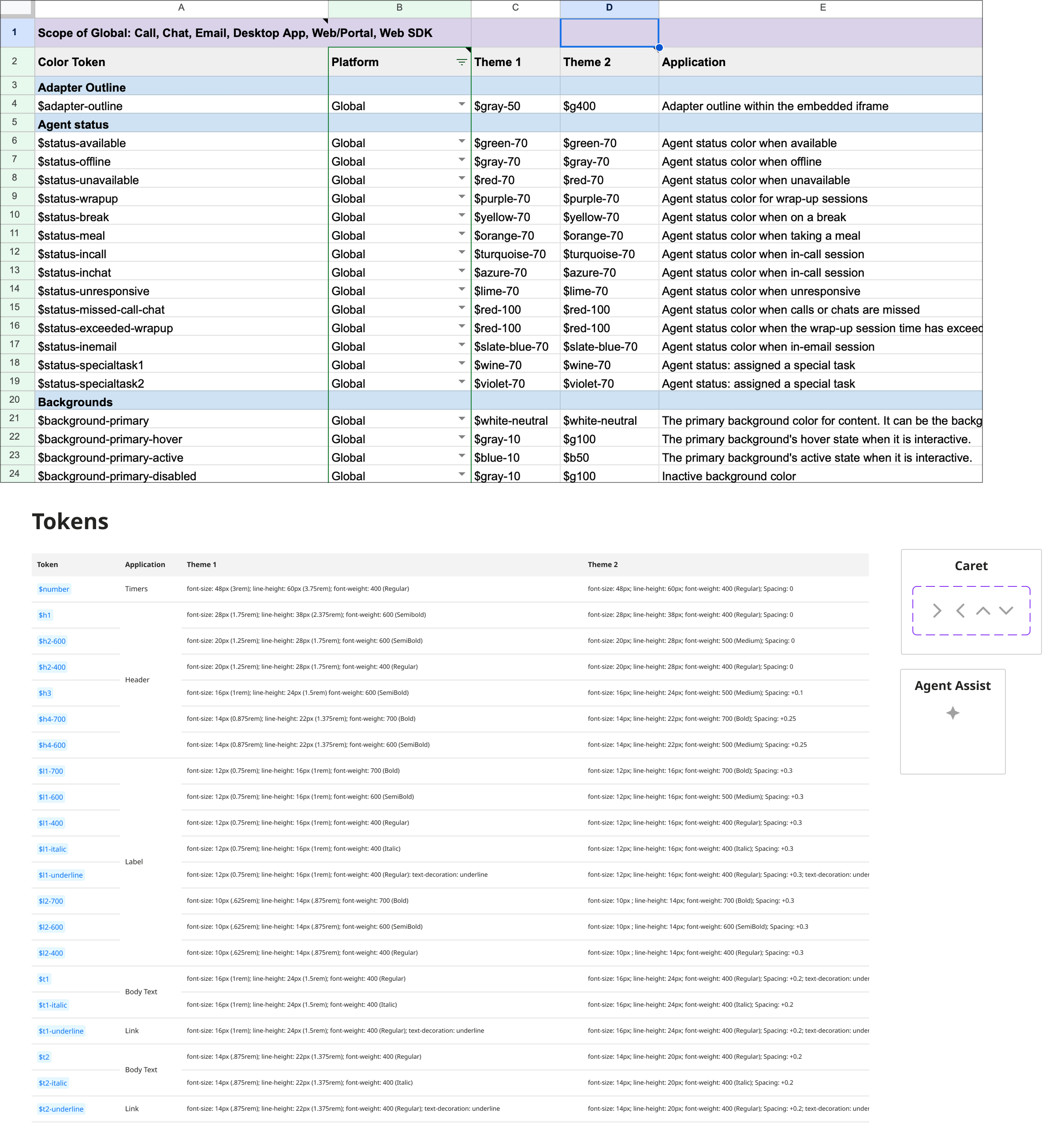
To bring consistency across the product ecosystem, I began by implementing a system of color tokens to manage the extensive variations in color usage. At the time, only raw hex values were used, and they varied significantly from project to project. To unify this, I created a centralized spreadsheet that allowed designers and engineers to easily reference, track, and update colors. I also introduced an intuitive naming convention that was easily understood by both designers and software engineers.
In addition to color, I established a standardized type hierarchy, as text styles had been inconsistently applied across different products. I also created and maintained a centralized icon library, assigning clear and descriptive names to ensure easy identification and consistent usage across all platforms.
These foundational steps helped set the stage for a cohesive design system, significantly improving both efficiency and consistency within the design and development teams.
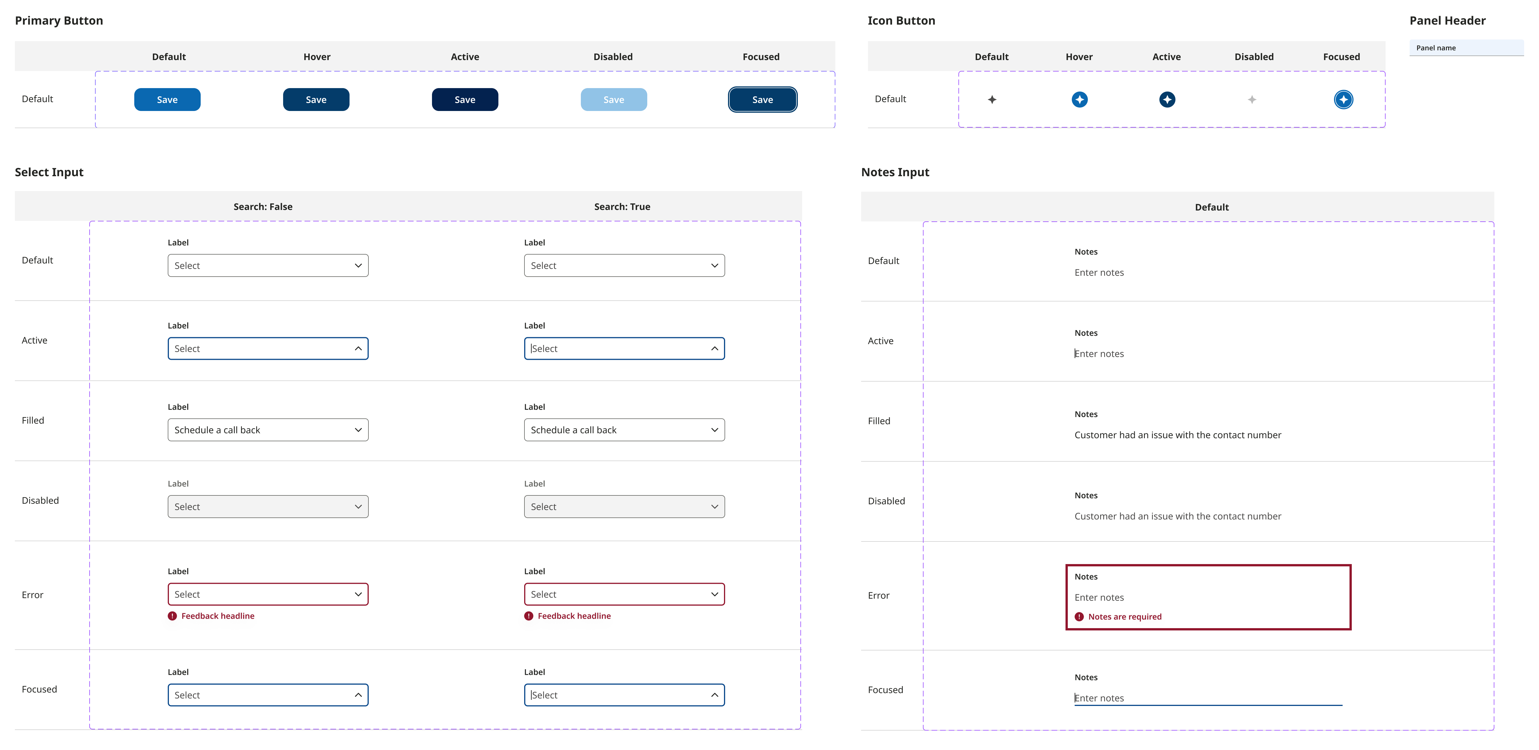
By breaking down existing UI elements, I created foundational "atom" components such as buttons, form inputs, and navigation bars, following Atomic Design principles. These components were designed to include all relevant interaction states, including default, hover, active, disabled, and focused, to ensure a complete and realistic user experience. I also accounted for size and type variants to support different use cases across platforms. These atom-level components became the core building blocks of the design system and were among the most commonly used elements throughout the product ecosystem.
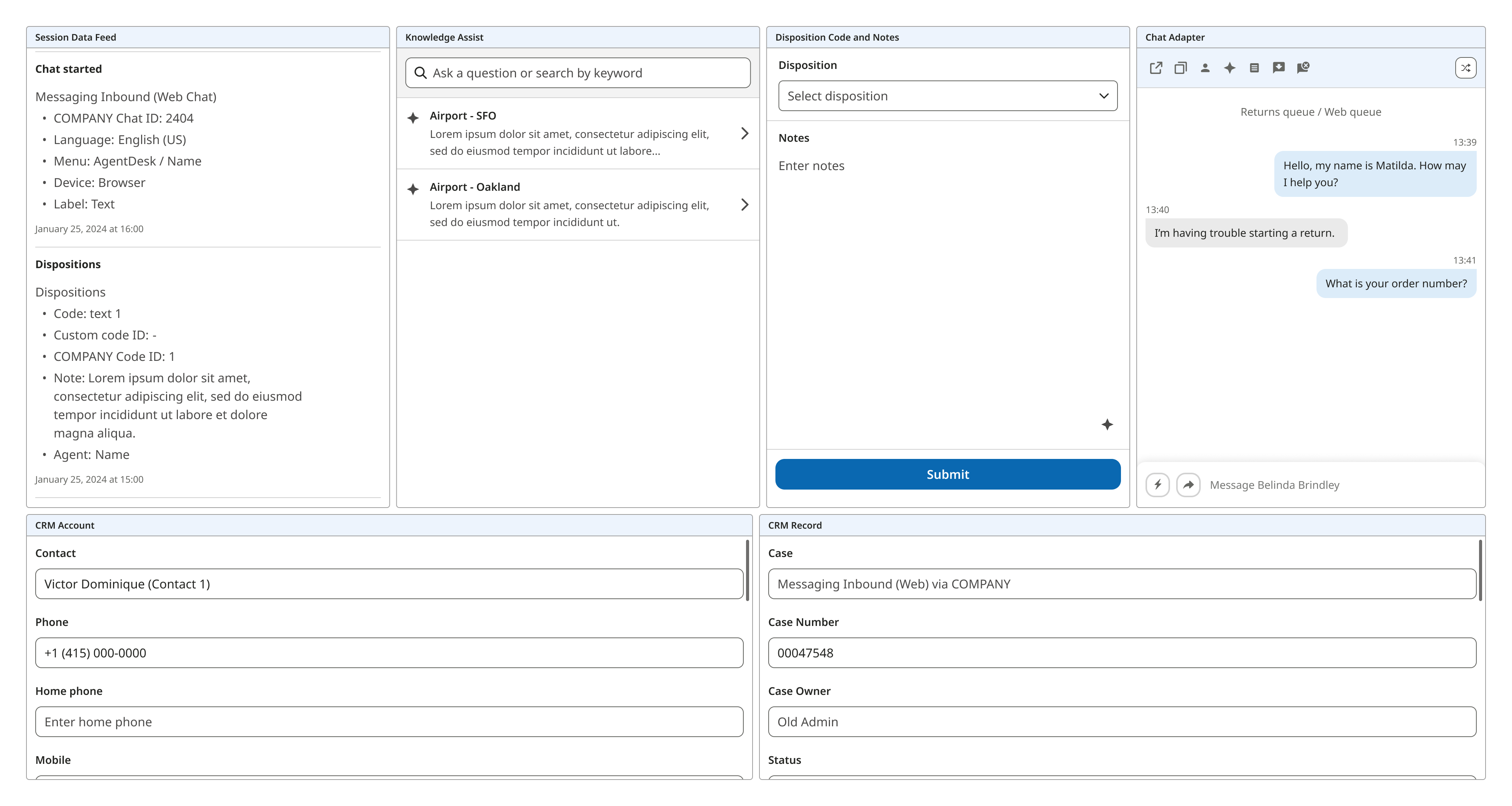
I combined atom components into reusable "molecule" components that could be placed directly onto a screen or integrated into larger, more complex components. I created molecule components when specific combinations of atoms were used frequently across multiple scenarios and required their own interaction states. These states often influenced multiple atom components simultaneously, making it more efficient and consistent to manage them as a single unit. This approach improved modularity, scalability, and streamlined the design-to-development handoff.
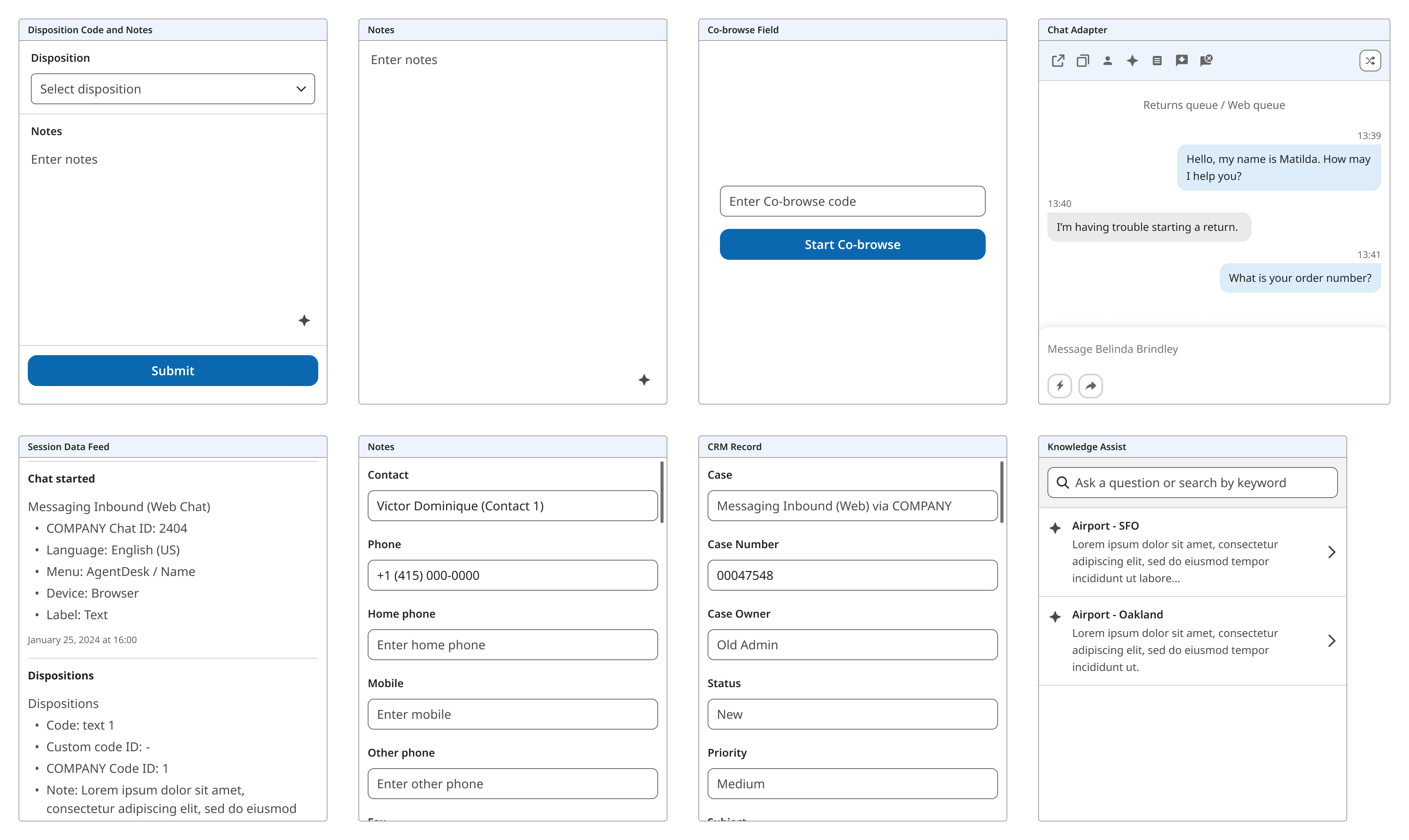
At this stage, I combined molecule components into an “organism” component. In this ecosystem, organism components are not commonly created since most complex layouts tend to be unique and used in specific scenarios. However, this particular organism was built for its versatility and reusability. It included multiple variations and was designed to allow easy swapping of molecule components within it, making it adaptable to different contexts while maintaining consistency.
For each component, I introduced detailed documentation and integrated clear requirements into our component creation process. In our fast-paced environment, engineers often missed key design details, which led to increased time spent in QA and post-development fixes. This ultimately reduced overall efficiency. To address the issue, I developed standardized documentation to ensure clarity and alignment between design and engineering. This included component anatomy, specifications, color usage, expected behaviors, and tooltip labels. By making these details easily accessible, I helped reduce confusion, minimize rework, and improve the overall quality and consistency of component implementation.
The siloed approach of maintaining separate design systems led to growing inconsistencies, particularly as the design team expanded and individual designers began implementing their own solutions. As the work evolved, I recognized the urgent need for greater alignment across platforms. While some platform-specific variations were necessary, I learned that maintaining consistency in foundational design elements is critical for scalability, brand cohesion, and development efficiency.
To address this, we established a unified, high-level design system that consolidated shared foundations such as color palettes, typography, commonly used atomic components, and iconography. This centralized system allowed each platform to maintain flexibility through its own design system, while still inheriting from a cohesive core.
In addition, I researched and implemented an open-source design system to accelerate development workflows. This decision was driven by our fast-paced environment and helped engineers build components more efficiently while maintaining consistency with the design foundation.
This experience deepened my understanding of scalable systems and highlighted the importance of balancing flexibility with standardization. By championing a shared design foundation and promoting modular, reusable components, I helped cross-functional teams deliver faster and more cohesively across a complex, multi-platform ecosystem.