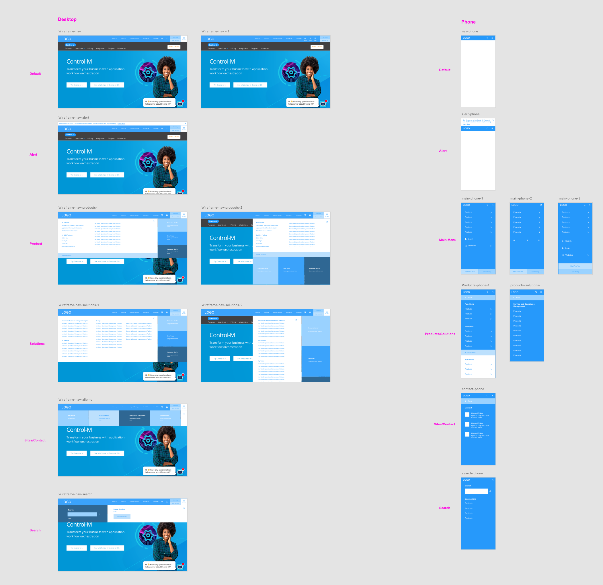
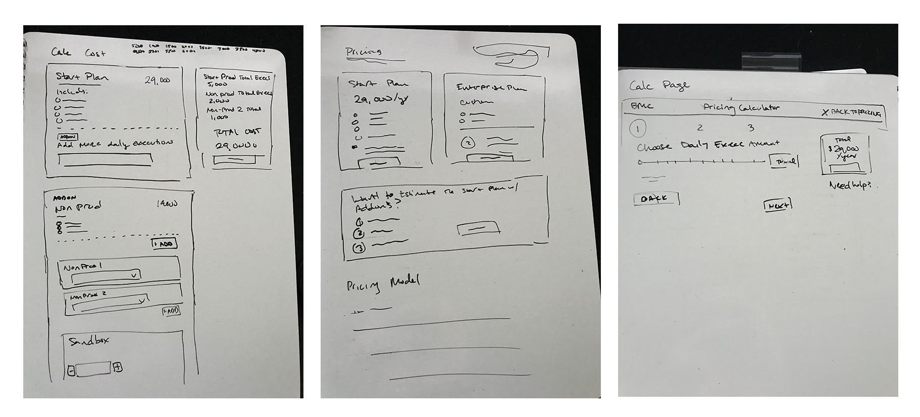
I created rough low-fidelity wireframes to iterate ideas for the most optimal layout of a complex feature. I mapped out how the user would go through each steps with no selections or every selection.
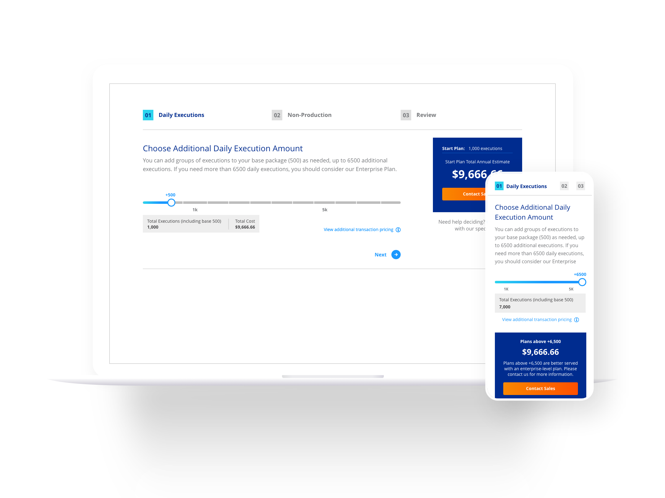
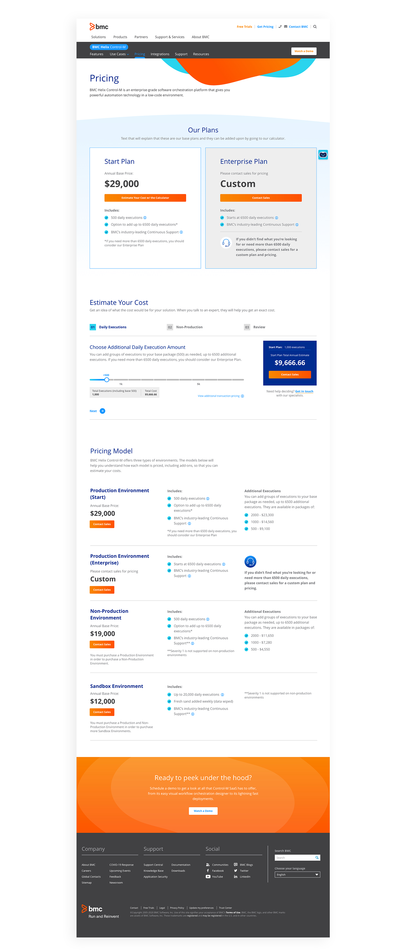
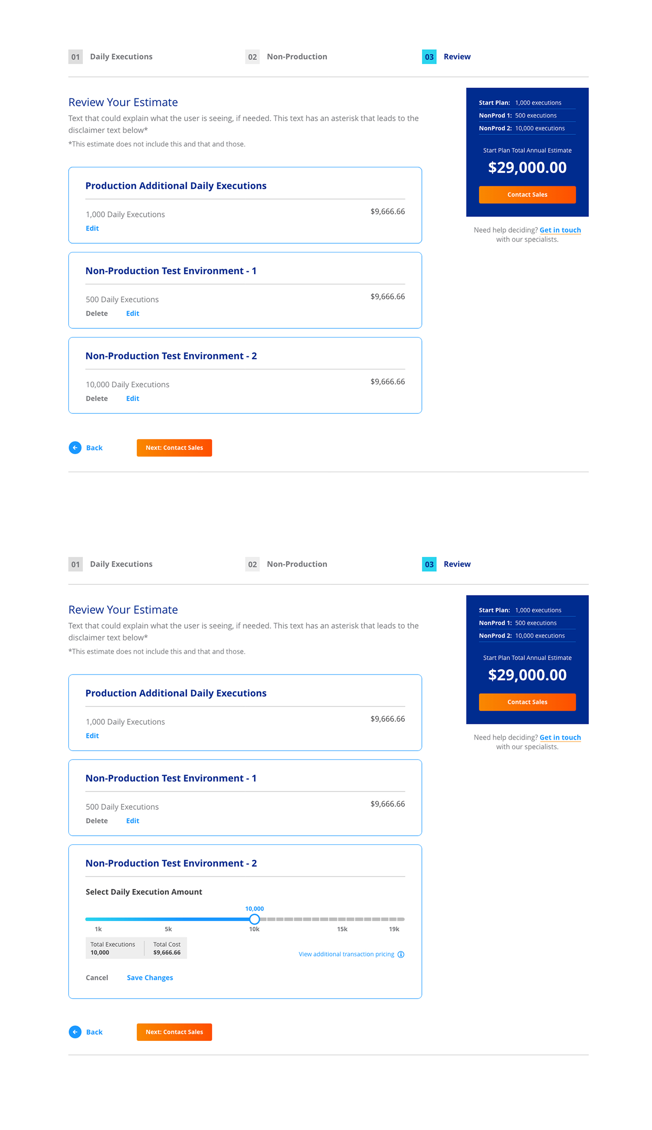
In the full page design, the page starts with a base pricing plan without any additional bells and whistles. We thought showing the base price would be less likely to intimidate low-budget customers. If a user required a custom plan, they can experience the calculator for a refined estimate. Lower on the page, we also wanted to include the entire pricing model for an easy scan at a glance.
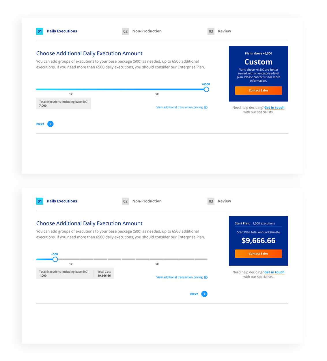
The user starts off with a range slider to select the amount of daily executions they would like in their package. The minimum is the amount included in the base price. The maximum amount is a step above the Starter Plan which indicates that if the user needs more executions, they should consider the Enterprise plan. At any step, the user can immediately send a form to Contact Sales. We didn't want to force users to go through the entire process to contact a salesperson.
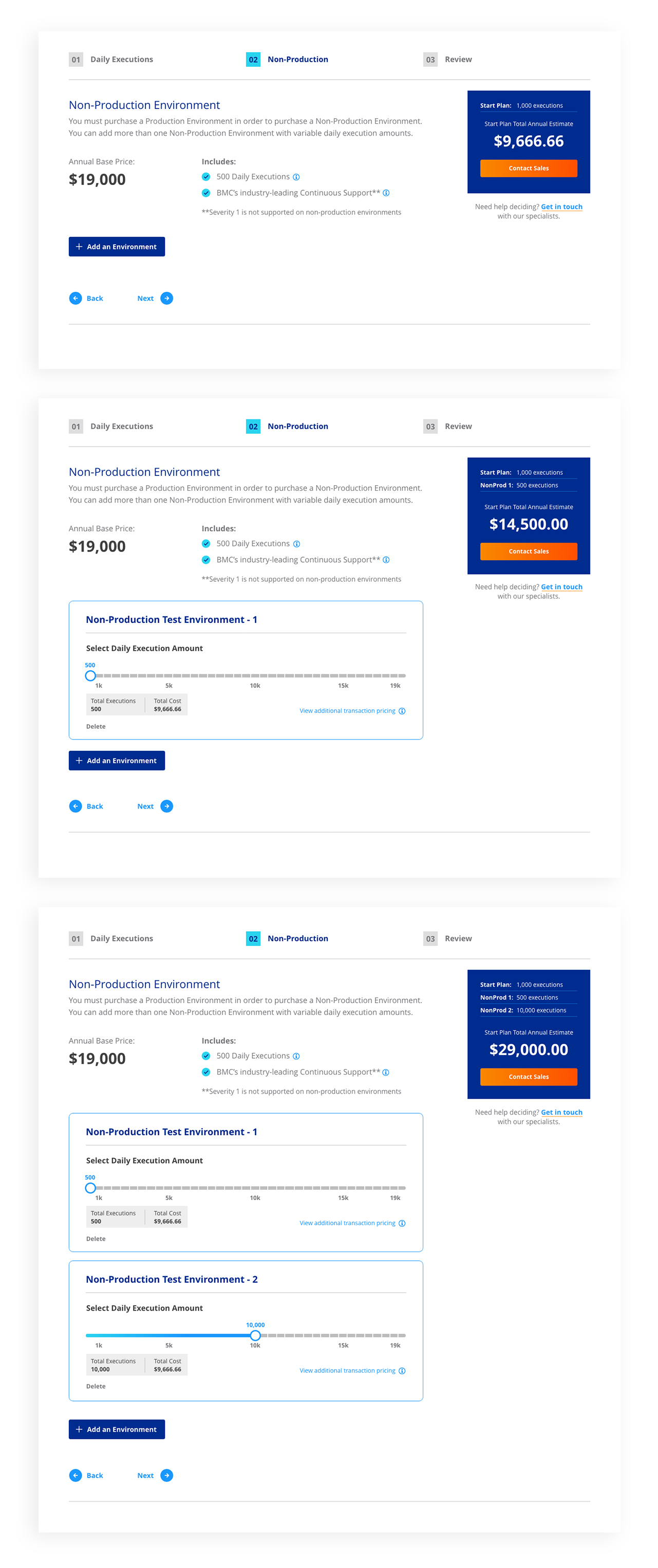
This step is for additional products included with the package plan. The user can skip or add an environment addition. They can add/edit/remove as many environments they need with various executions. For each environment, there also had to be an execution slider which is a similar experience to the previous step.
In the review step, the users can see an overview of the entire estimate. They also still have the ability to edit any packages on the review page without going back a step.
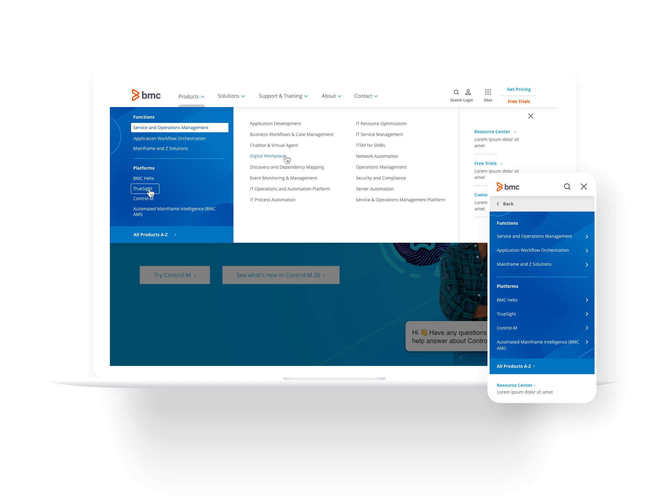
To start, I created wireframes to iterate ideas for the most optimal presentation of information. I used this to map out what screens will use the same template and how all elements will move throughout platforms. I also presented these wireframes to the stakeholders for efficient use of time.